Kids Greening Taupo Logo
My name’s Sian Moffitt. I’m currently in my first year at Victoria University in Wellington, where I’m studying ecology and biodiversity. Last year, while in Year 13 at Tauhara College I was offered the chance to be involved in designing the Kids Greening Taupo logo.
The purpose of the logo was to capture the essence of the Kids Greening Taupo programme using the main themes of youth and nature. To start the process I did some research into existing environmental logos and the Greening Taupo logo.
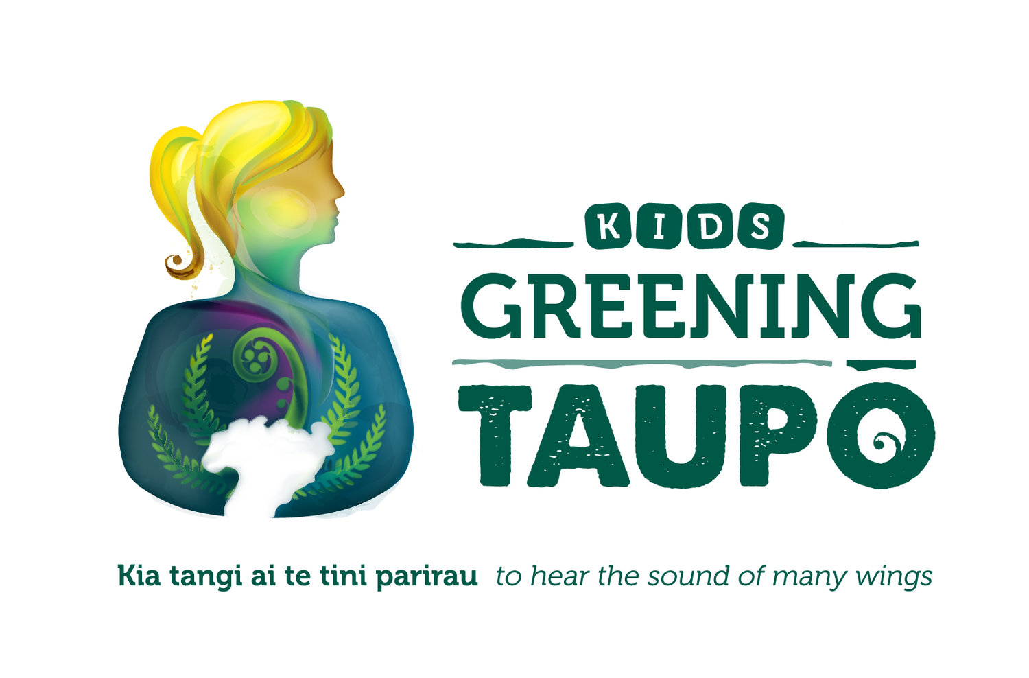
I took the ideas to my first meeting with Donnee at GOOD Graphic Design where we discussed logo possibilities for Kids Greening Taupo. We talked about the text font and about keeping the same font as Greening Taupo, but adding in the word ‘kids’ above this. The font for this is made to look like toy building blocks, which represent youth building the future.
With some great ideas to start on I went away to design my first concepts ready for the next meeting where I worked on symbolism with representatives from iwi, DOC and Greening Taupo. This collaboration made sure everyone involved with the programme had their say in the logo development.
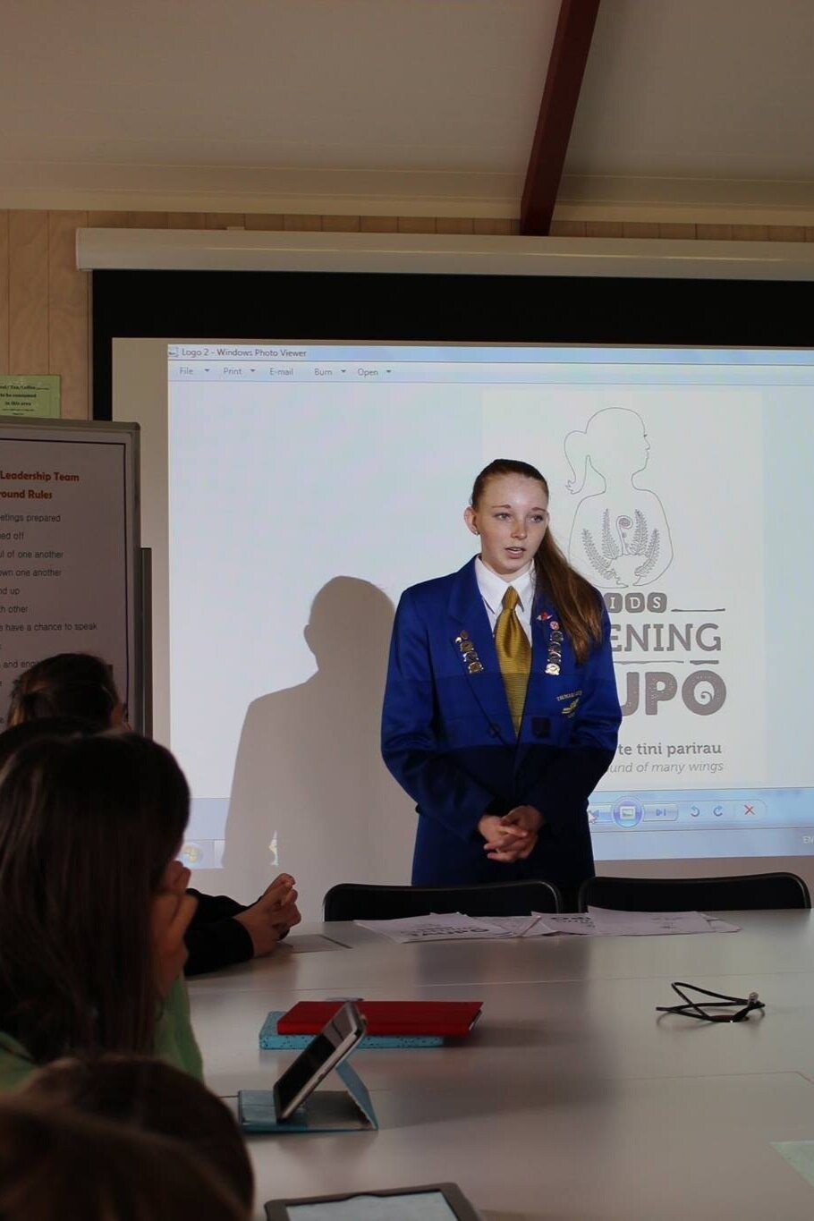
I went away again to use these new ideas to help improve my designs and bring them into the final stages of production. It was time to present the logo concepts to the student leadership team.
At the student leadership meeting I spoke on the significance of two logos and the student leaders gave me feedback before voting on their favourite. Donnee and I met again to discuss colours and make slight adjustments to bring the concept to a finished logo.
This was a great experience as I didn’t know how hard it was to decide on logo colours until I was there in the moment. Donnee was left with the logo while I headed off overseas for three weeks in Italy for Rockclimbing.
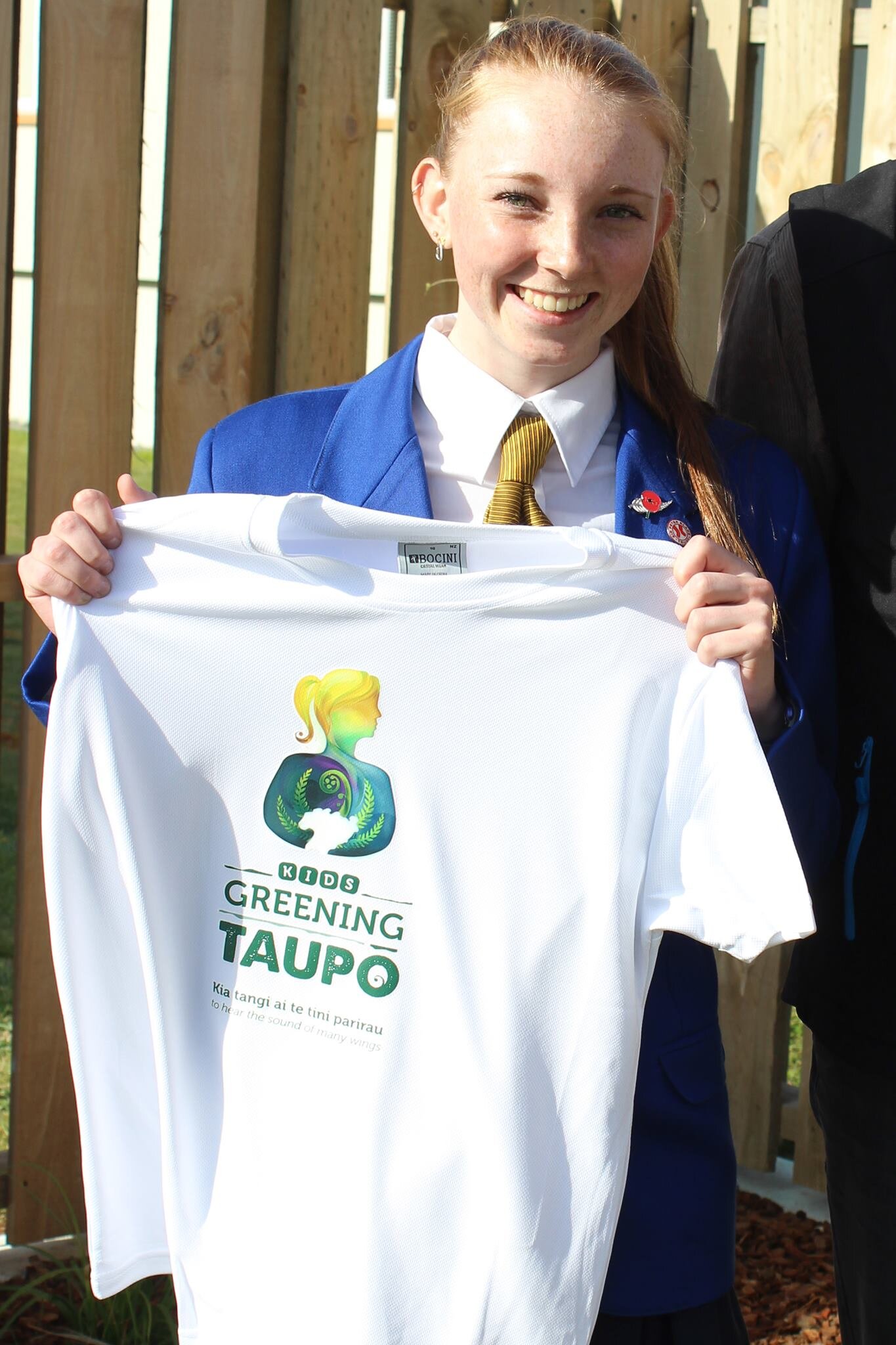
While I was in Italy my mum was updating me by email with new logo touch ups and I would contact Donnee and the team through her. I was so excited to see the logo on t-shirts, letters and invites to the launch on my return. This was a big step for me and thanks to Donnee who made this all the more special with the vibrant blend of colours.
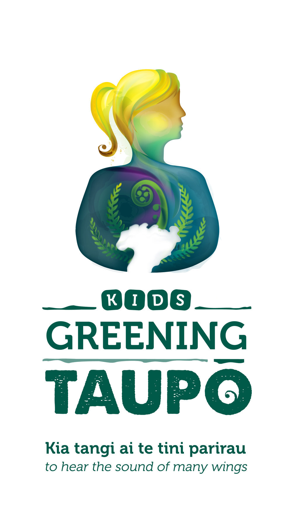
In the logo the girl represents Kids and the student leadership involved in the Kids Greening Taupo programme. In her arms she is holding Lake Taupo which is the water helping local nature bloom. The four ferns and koru represent the five hapu associated to Lake Taupo and the gap between her arms shows the idea of the only exit being via the Waikato River. The nature is near her heart and she is embracing this in her loving arms showing her commitment and involvement with nature.
I believe this logo represents the interactions within the Kids Greening Taupo programme through the student leadership and efforts put in by the schools to attract more birdlife into the Taupo district.
